Since 2000, Pantone has named its “Color of the Year”. For the first time this year, they created a new shade that wasn’t in its existing catalogue of colours before. They have blended blue tones with a violet-red to create PANTONE 17-3938 Very Peri. In the announcement Pantone writes: “Displaying a carefree confidence and a daring curiosity that animates our creative spirit, inquisitive and intriguing PANTONE 17-3938 Very Peri helps us to embrace this altered landscape of possibilities, opening us up to a new vision as we rewrite our lives. Rekindling gratitude for some of the qualities that blue represents complemented by a new perspective that resonates today, PANTONE 17-3938 Very Peri places the future ahead in a new light.
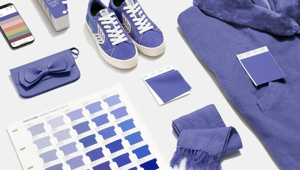
PANTONE 17-3938 Very Peri, a warm and friendly blue hue with a carefree confidence and joyful attitude, emboldens uninhibited expression and experimentation. Photo: Pantone
We are living in transformative times. PANTONE 17-3938 Very Peri is a symbol of the global zeitgeist of the moment and the transition we are going through. As we emerge from an intense period of isolation, our notions and standards are changing, and our physical and digital lives have merged in new ways. Digital design helps us to stretch the limits of reality, opening the door to a dynamic virtual world where we can explore and create new colour possibilities. With trends in gaming, the expanding popularity of the metaverse and rising artistic community in the digital space PANTONE 17-3938 Very Peri illustrates the fusion of modern life and how colour trends in the digital world are being manifested in the physical world and vice versa.”
dezeen doubts the sense and usefulness of a “Color of the Year”
In dezeen, one of the world’s most popular and influential architecture, interiors and design magazine, the author Michelle Ogundehin doubts the sense and usefulness of Pantone’s “Color of the Year”. They think it’s time to reconsider the whole colour of the year carnival. And the article continues: “With its choice of a shade of purple, which it claims is blue, as colour of the year, Pantone has once again failed to use the opportunity to talk meaningfully about how colour reflects moments.” Under the circumstances of the last few years, it is hardly possible to identify traditional trends today. Far more important issues, such as health, community, sustainability or the climate, should inspire us to think about what we want for ourselves. And contrary to this, the big paint companies like Pantone still believe that they have to designate a single shade of colour as emblematic for the coming year.
The author Michelle Ogundehin, a thought-leader on interiors, trends, style and wellbeing, ends her dezeen article with the following conclusion: “But wherever you stand on the legitimacy of colour psychology, it cannot be denied that different colours reflect different moods and moments. Shades inevitably flow in and out of popular consciousness, whether buffeted by fashion or political concerns. Colour of the year could be an opportunity to talk meaningfully about such issues. Once again, Pantone choose not to rise to that challenge.”
About Pantone Color of the Year
The Pantone Color of the Year selection process requires thoughtful consideration and trend analysis. To arrive at the selection each year, Pantone’s colour experts at the Pantone Color Institute™ comb the world looking for new colour influences. These can include the entertainment industry and films in production, traveling art collections and new artists, fashion, all areas of design, popular travel destinations, as well as new lifestyles, playstyles, and socio-economic conditions. Influences may also stem from new technologies, materials, textures, and effects that impact colour, relevant social media platforms and even upcoming sporting events that capture worldwide attention. For 23 years, Pantone’s Color of the Year has influenced product development and purchasing decisions in multiple industries, including fashion, home furnishings, and industrial design, as well as product packaging and graphic design.
About PANTONE Color Institute™
Pantone Color Institute is the business unit within Pantone that highlights the top seasonal runway colours, selects the Pantone Color of the Year, forecasts global colour trends, and advises companies on colour for product and brand visual identity. Through seasonal trend forecasts, colour psychology, and colour consulting, Pantone Color Institute partners with global brands to effectively leverage the power, psychology, and emotion of colour in their design strategy.